The History of Lodge's Skillet & Egg Logo
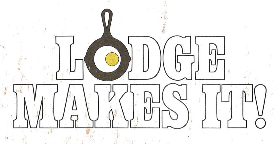
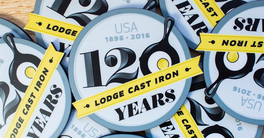
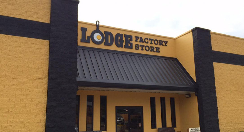
In 1973 Lodge created its first official logo. At the time no one imagined the simple black skillet frying a single egg would become an iconic symbol of American-made cast iron cookware. While we have embellished and updated the logo since then, that same skillet icon is still being used to represent the Lodge brand both domestically and around the world.
The first mention of the Lodge logo appears in a letter written by CEO Dick Kellermann in 1973.
"Bob took me to see the new logo he has been working on with Scott Sullivan in Chattanooga," he wrote. "The O is a black skillet with the handle at the top with an egg off center to represent an O. Looks good."
The Bob in that letter is Bob Kellermann, Lodge's current CEO Emeritus. He says developing a logo for the brand had been a long-term goal. "I always wanted to have a brand identity, and before 1973 we didn't have one," he says. "Our brand was not on our products. When Scott came up with the idea for the logo, he showed me some designs, and I told him he was right on target. We've been building on it ever since."
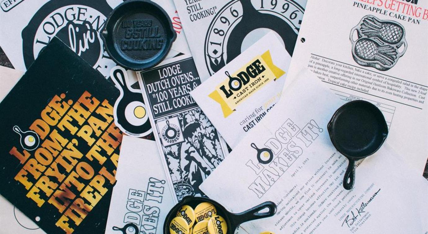
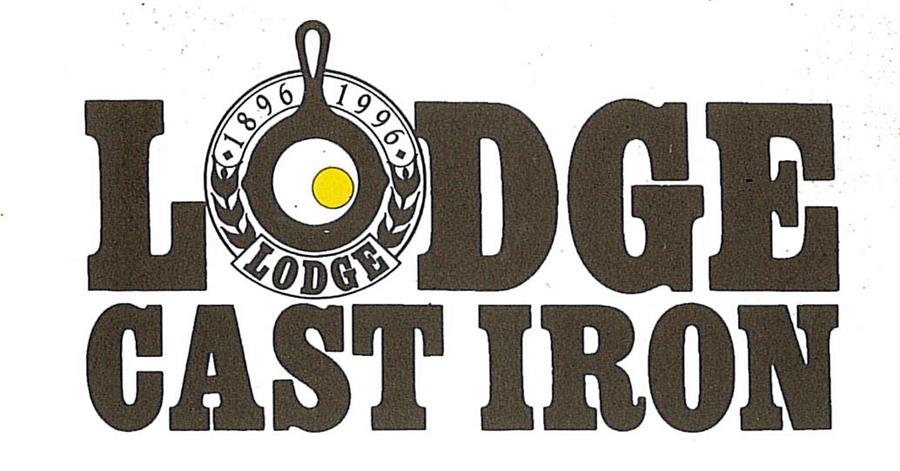
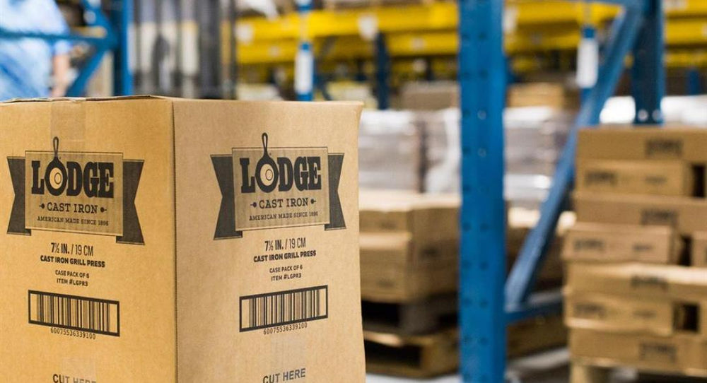
In later years different phrases were added to the logo and the colors were rearranged several times, but the black, white and yellow color pallet has remained consistent, just like the skillet. Here are a few examples of how the logo has changed since its creation.
